A design system that enhances user experience through consistency and hierarchy, accelerates development, and provides clients with the flexibility to tailor the experience to their needs.

Context
As a new hire, my first task was to perform a heuristic evaluation of Gozio’s app, analyzing its existing styles, interactions, content, and patterns.
I identified opportunities for improvement and redesign to enhance usability and overall user experience.
Goal
Designing a white-label app introduces unique challenges, so my goal was to objectively assess the experience from three key perspectives:
The End User – Ensuring a seamless and intuitive experience
The Client – Providing flexibility and brand alignment
The Developer – Streamlining implementation and scalability
Legacy App
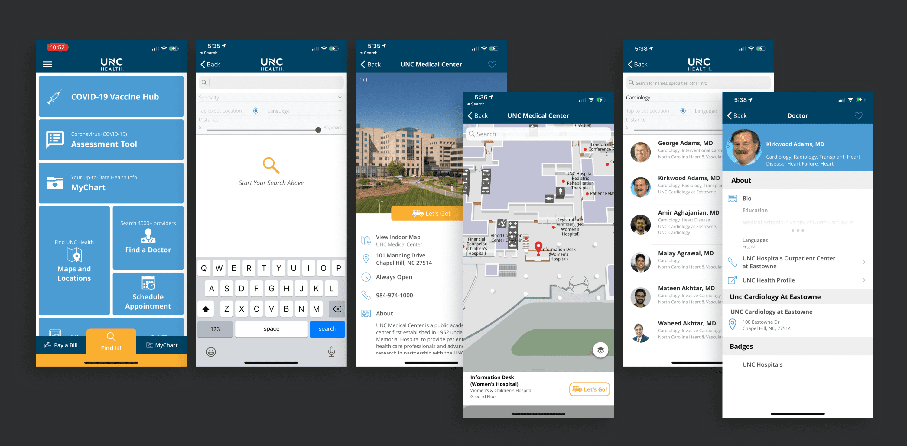
Heuristic Evaluation
Key Insights
Information is presented without clear visual hierarchy, making content difficult to scan or prioritize.
Typography lacks distinction and structure, resulting in poor readability and emphasis.
Navigation patterns are unconventional and inconsistently applied, leading to user confusion.
Map controls and labels lack legibility.
Iconography is inconsistent in style and usage, diminishing clarity and cohesion.
The header bar is the only place for client branding
Building the Design System
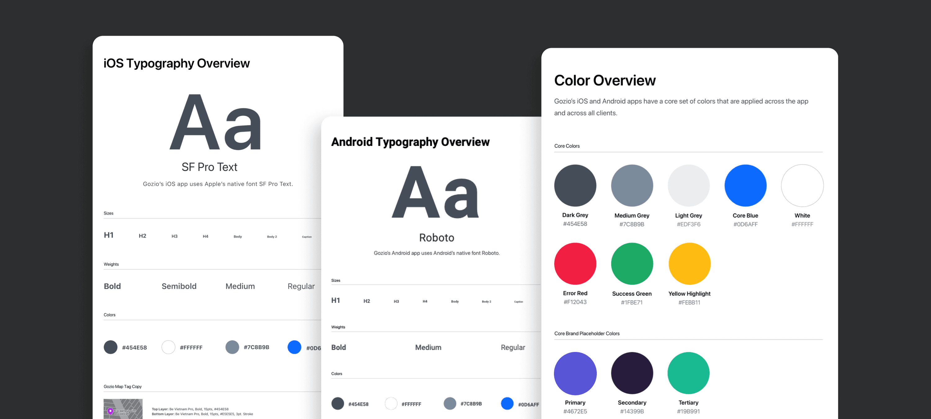
Style: Color & Typography
A consistent style is essential for creating a cohesive user experience, building trust, and ensuring efficiency across the app’s design and development.
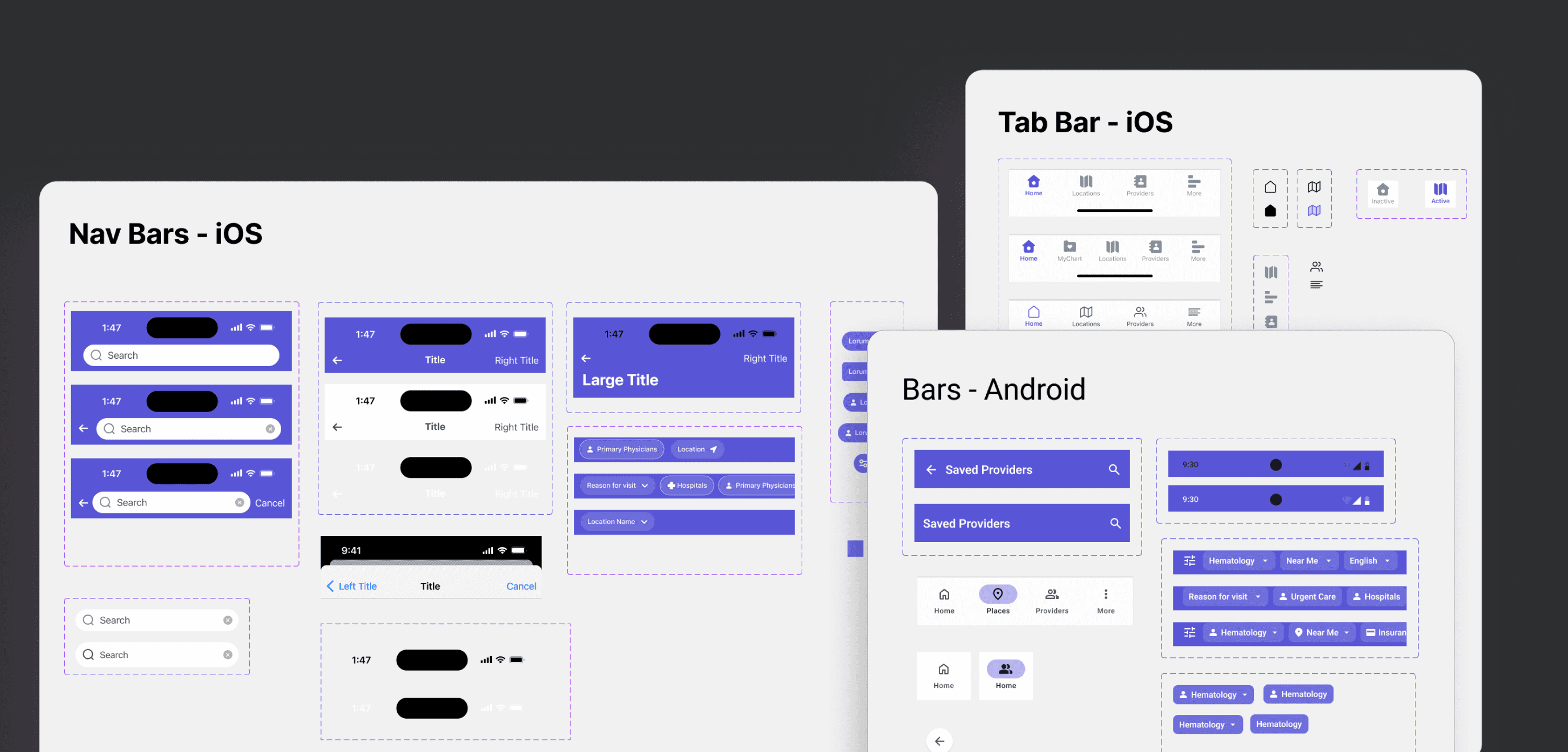
Header & Tab Bars
The legacy app lacked platform-specific (iOS and Android) header bars and navigation, resulting in a confusing and unfamiliar UX. I introduced native navigation patterns into the design system and added an expandable sub-navigation for screens requiring additional filtering.

Illustration & Icon Library
Consistent and reusable icons enhance UI scalability, ensure visual coherence across features, and streamline implementation by leveraging shared components.

Image Spacing & Size, Tags & Forms
Standardizing image sizing, spacing, tags, and form elements ensures visual consistency, improves usability, and simplifies maintenance across the app’s interface and codebase.
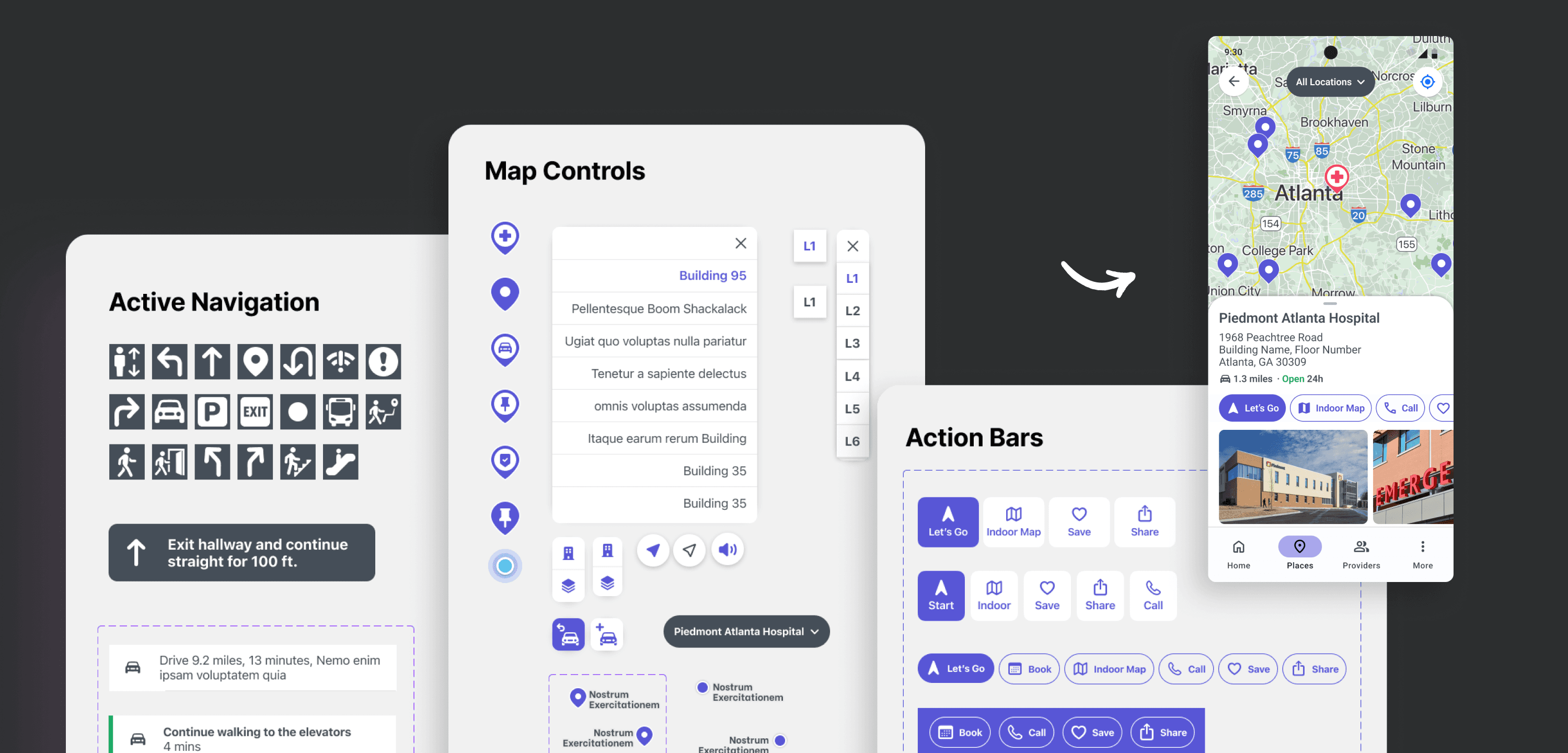
Navigation & Map Controls
Drawing inspiration from wayfinding UX standards used in apps like Google Maps and Apple Maps, I helped users better orient themselves within the Gozio app. I then designed custom elements with a distinct visual identity tailored to our brand and user needs.

Cards and Panels
By leveraging elements from the design system, I created standardized cards, components, panels, and screen templates—promoting consistency, efficiency, and scalability across the app.
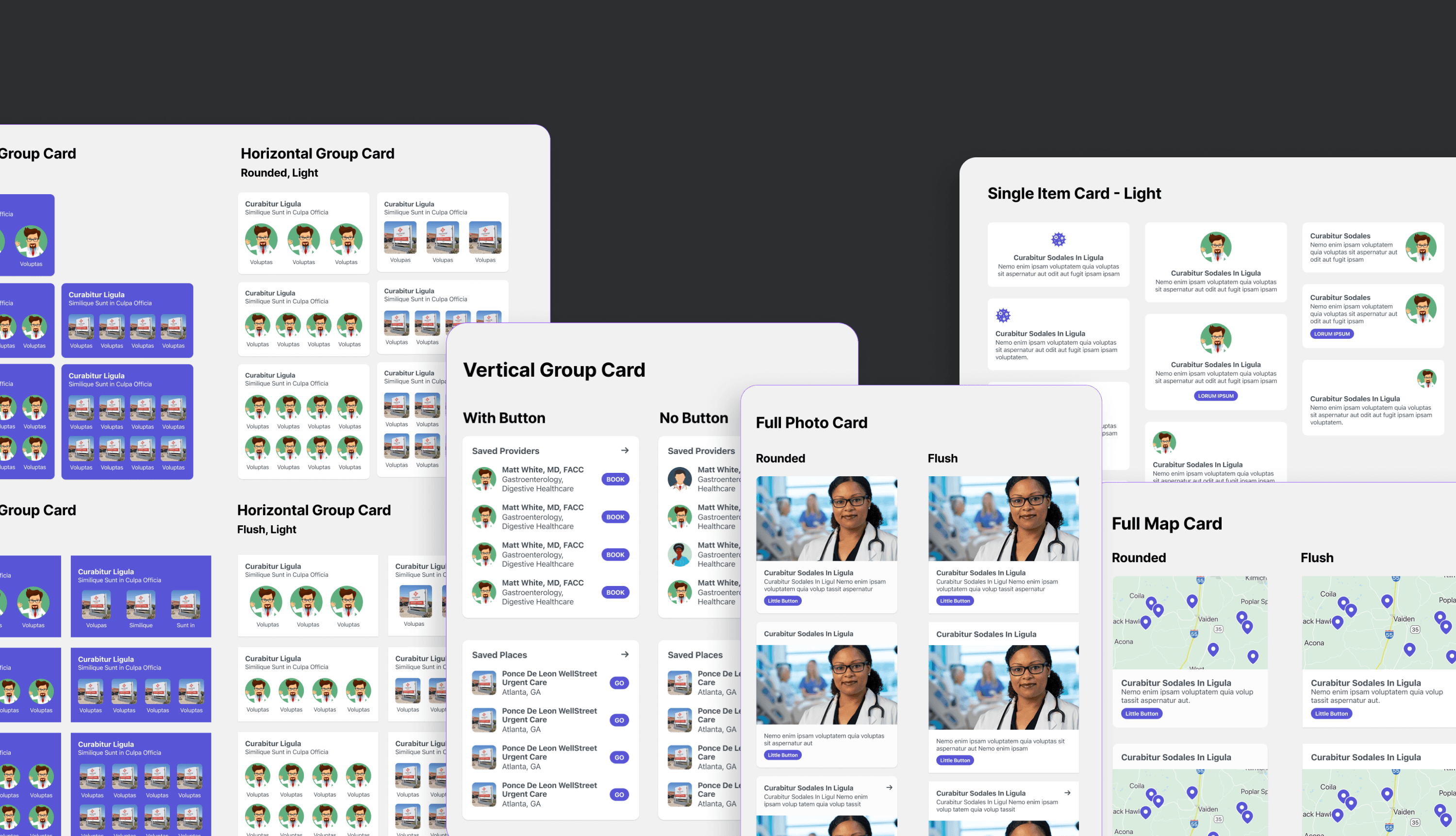
Dashboard Cards
I designed a flexible system of dashboard cards for the app’s Home Screen. Though the cards appear varied, they’re built from a small set of shared components. Content can be grouped and displayed vertically or horizontally, large imagery can be featured, and maps can surface live data.
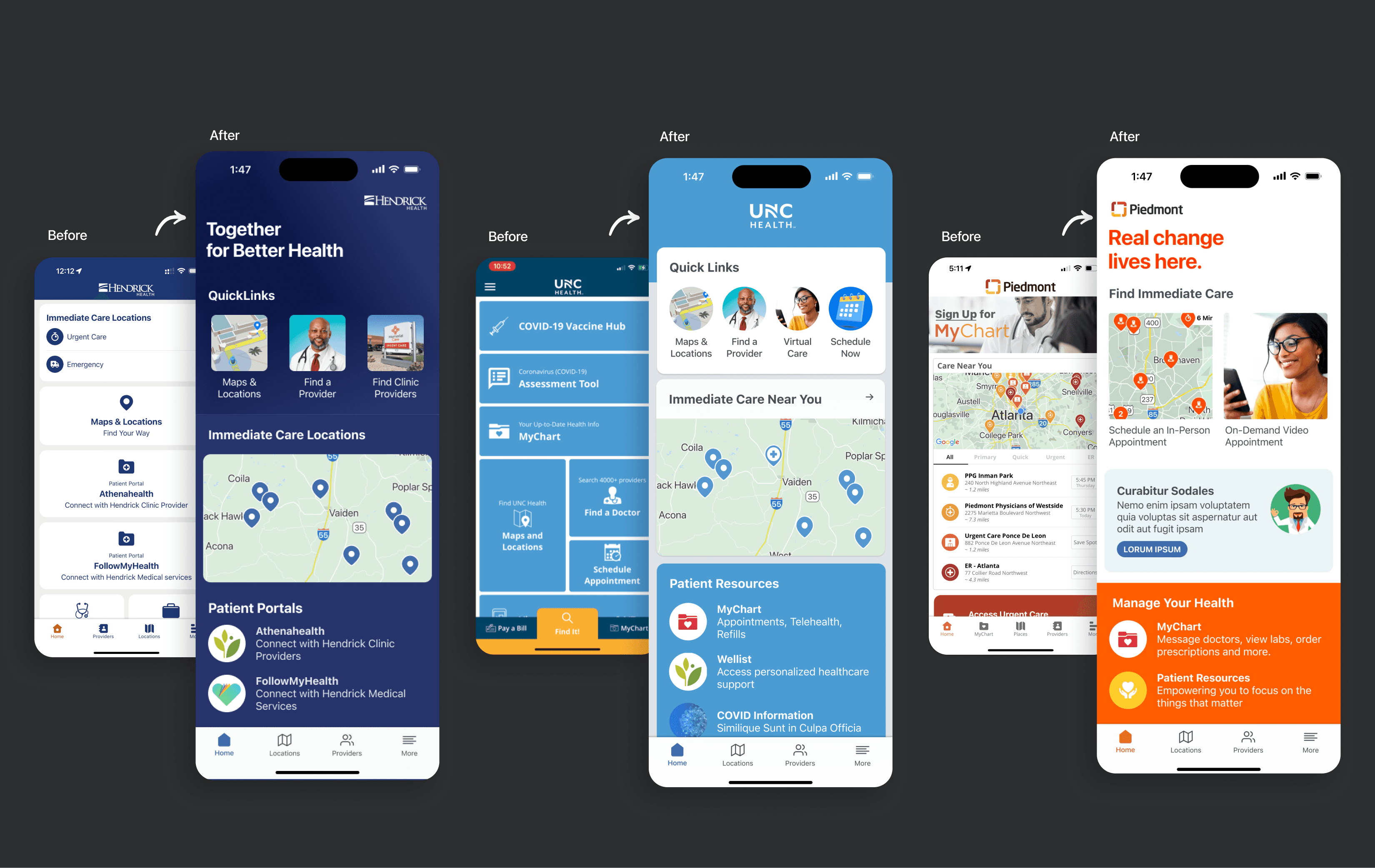
Dashboard Results
The interface transformed from static boxes into a more dynamic and user-friendly experience. Clients were able to make better decisions about what information is most important to users while also tailoring the app to their brand.
Other Assets Designed
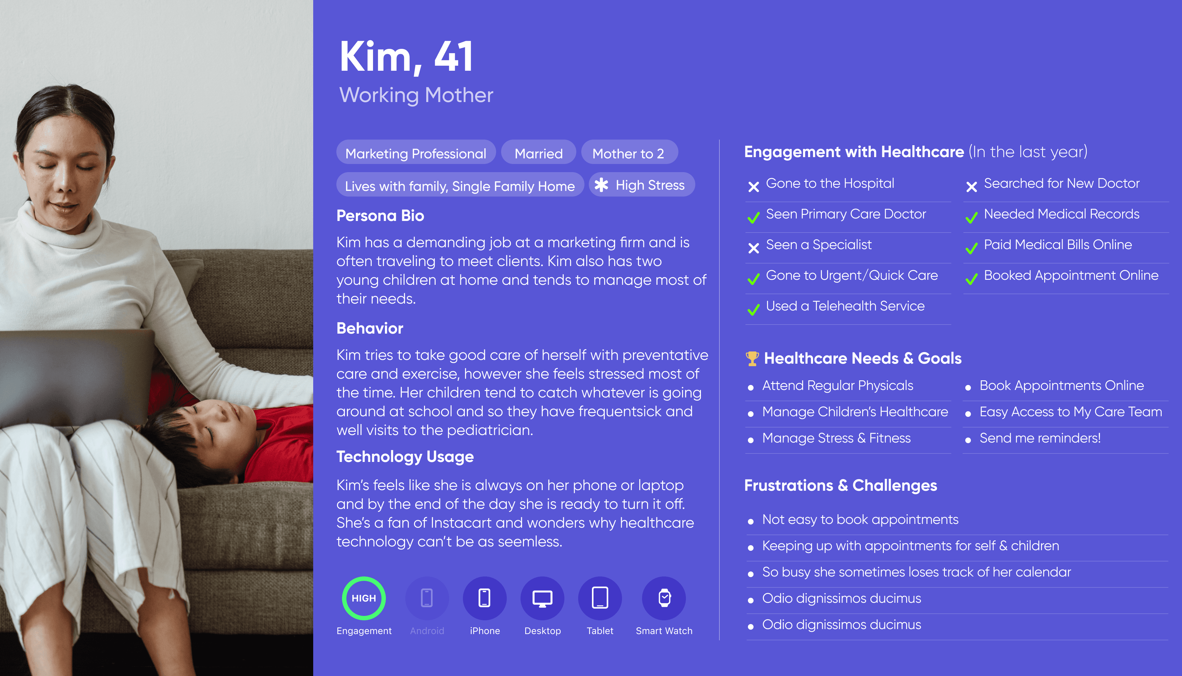

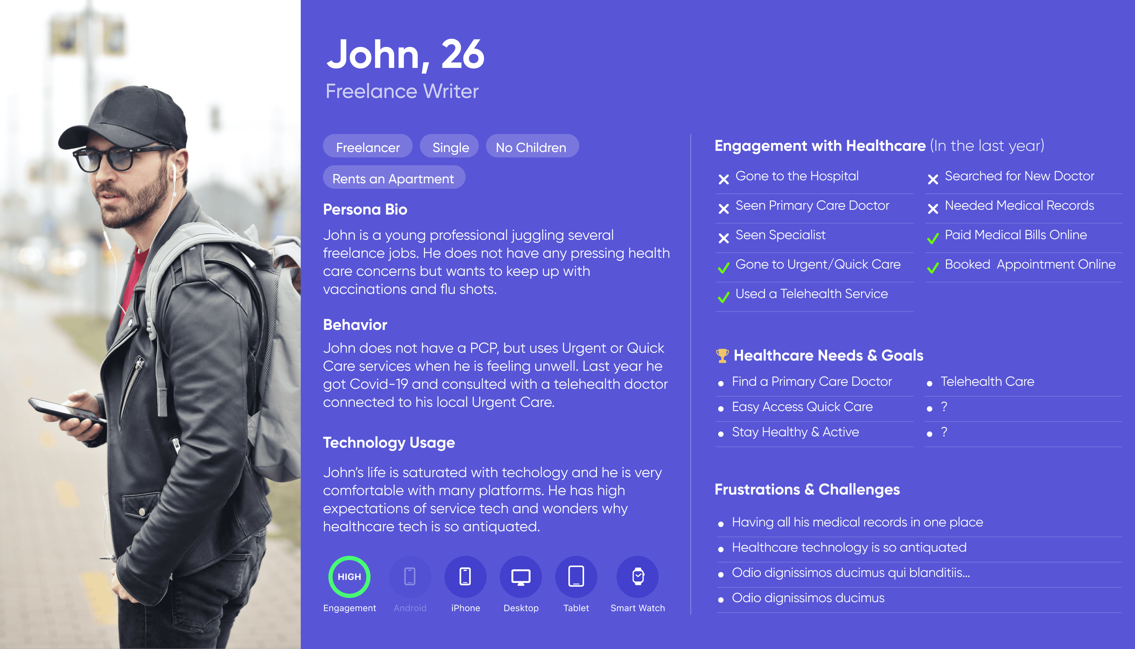
Personas
I created three key user personas to guide design decisions for the healthcare app, representing an older patient managing daily care, a busy caregiver coordinating appointments, and a tech-savvy adult seeking on-demand services.