Sallie Mae

Context
After seeing a pitch that included a prototype I designed, Sallie Mae selected Stable|Kernel to design and build their first native mobile and watch app. Our task was to create a mobile app that makes the loan repayment process as quick and simple as possible so that borrowers would be less likely to have delinquent accounts.
Goal
Discovery workshops, user journeys, wireframing, UX and UI design and development handoff.
Designed for
Stable|Kernel
Role
Lead Product Designer
Platforms
Timeline
8 Months
Team
Discovery

Workshops
Key Insights
Many users manage multiple loans, each with different due dates, statuses, and interest rates.
The current web-based payment system is confusing and time-consuming to navigate.
As a result, some users allow loans to slip into delinquency—potentially due to the system’s lack of clarity and usability.
Success means eliminating guesswork and guiding users with a clear, intuitive repayment experience.
Design Process

User Flows
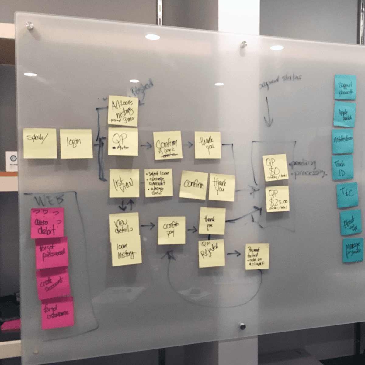
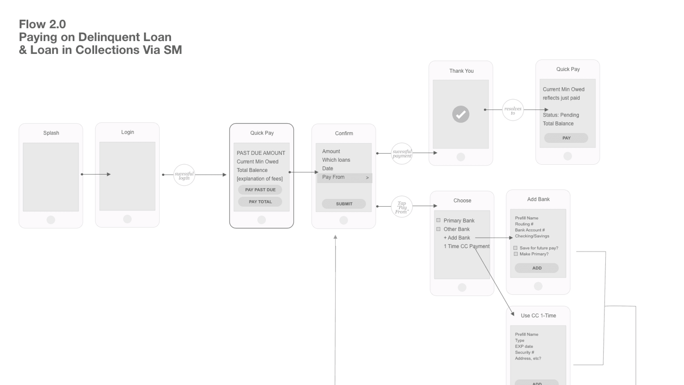
Flows included sign up, login, quick pay, pay individual loans, managing account, adding banks, autopay, delinquent and various collection states.
Working closely with development and SM, I documented all user flows to ensure we understood all the nuances .

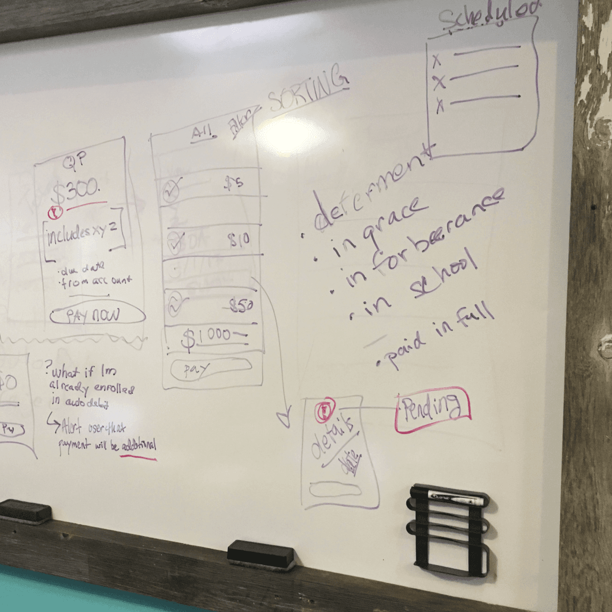
Wireframes
Wireframing the app screens ensured we had the proper content and states on the correct screens.
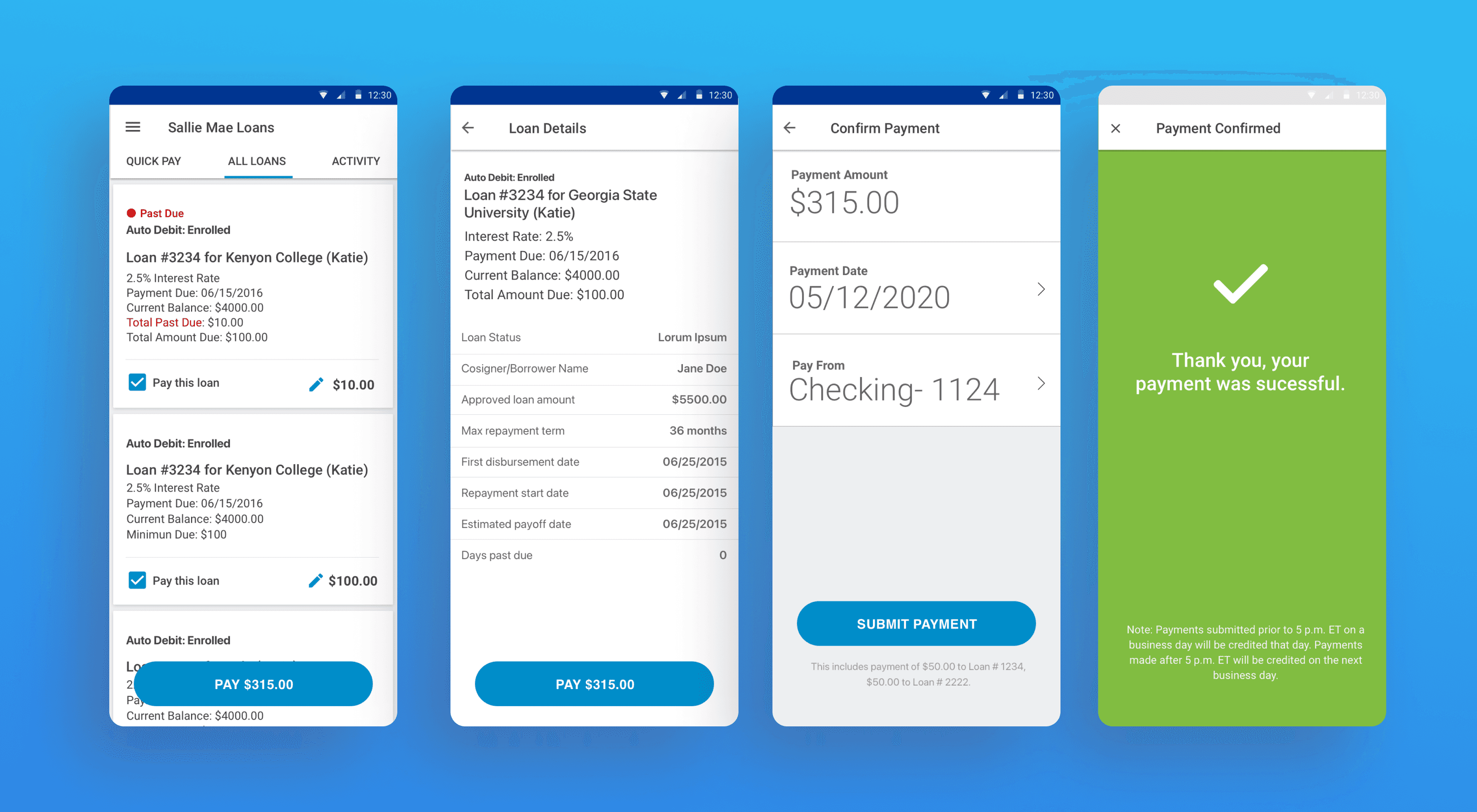
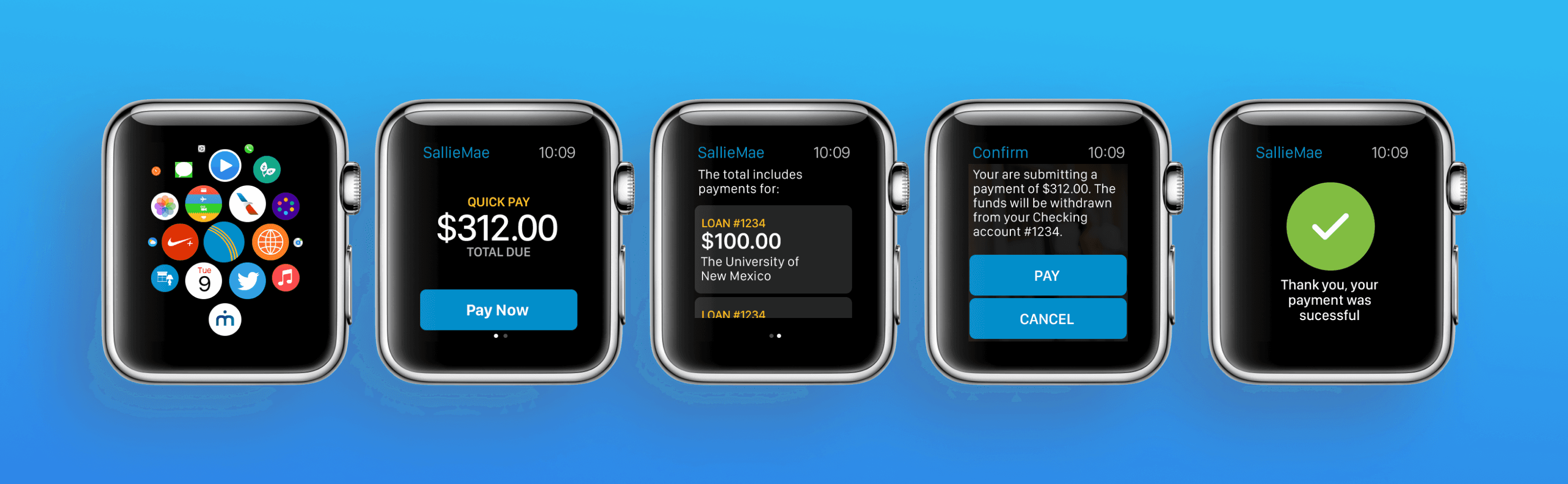
I chose to have the default screen show what we called "Quick Pay". Quick Pay totaled all the minimum due balances for all loans and provided one button to make the transaction happen.
Internal testing was done to validate our work


Outcome
The mobile application has led to a more than 45% adoption rate by Salle Mae’s loan customers - at the time, a higher adoption rate than the mobile banking industry standard - and has strengthened its brand connection with students and their families. The app has won numerous FinTech, personal banking, and wearables awards.