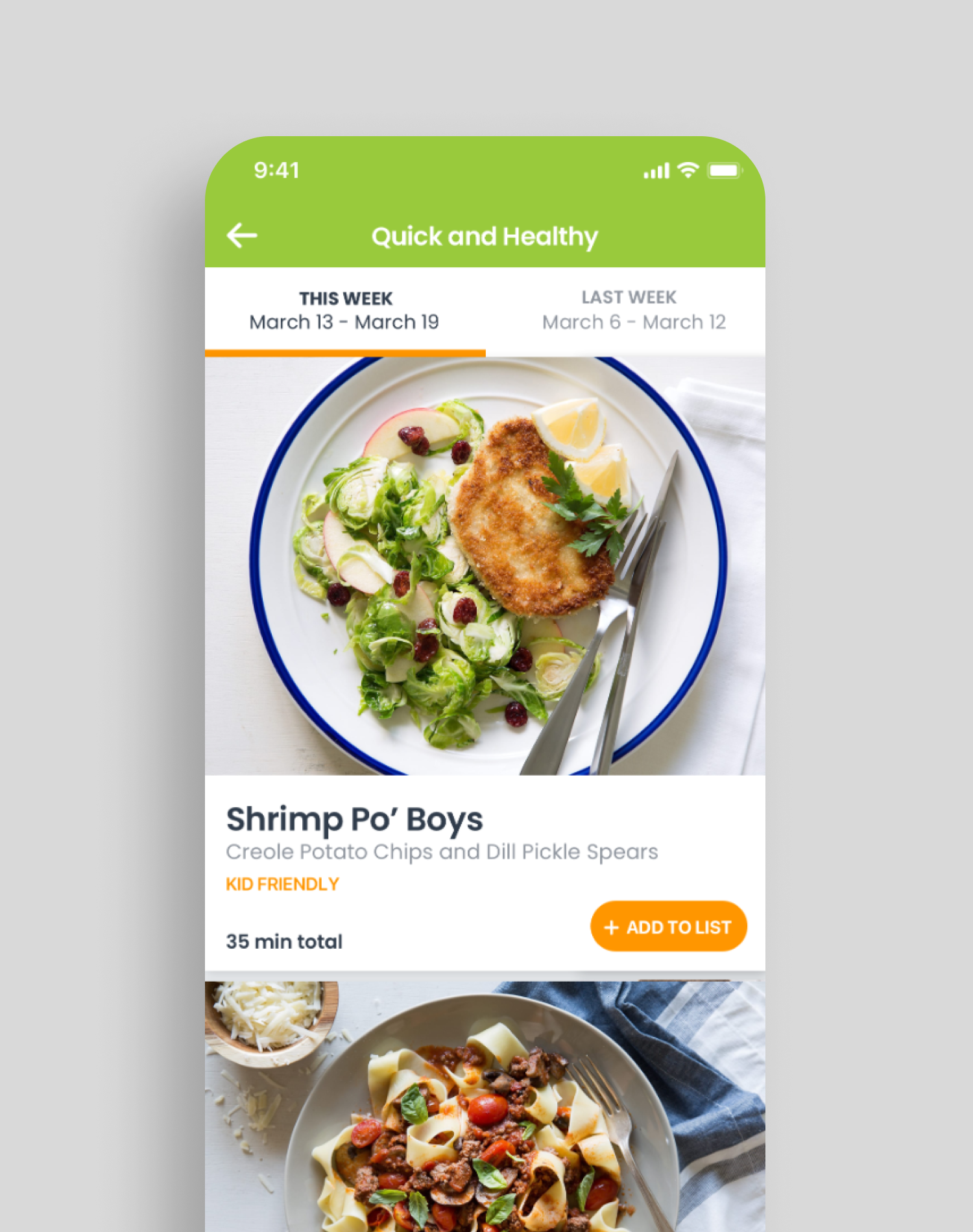
eMeals App
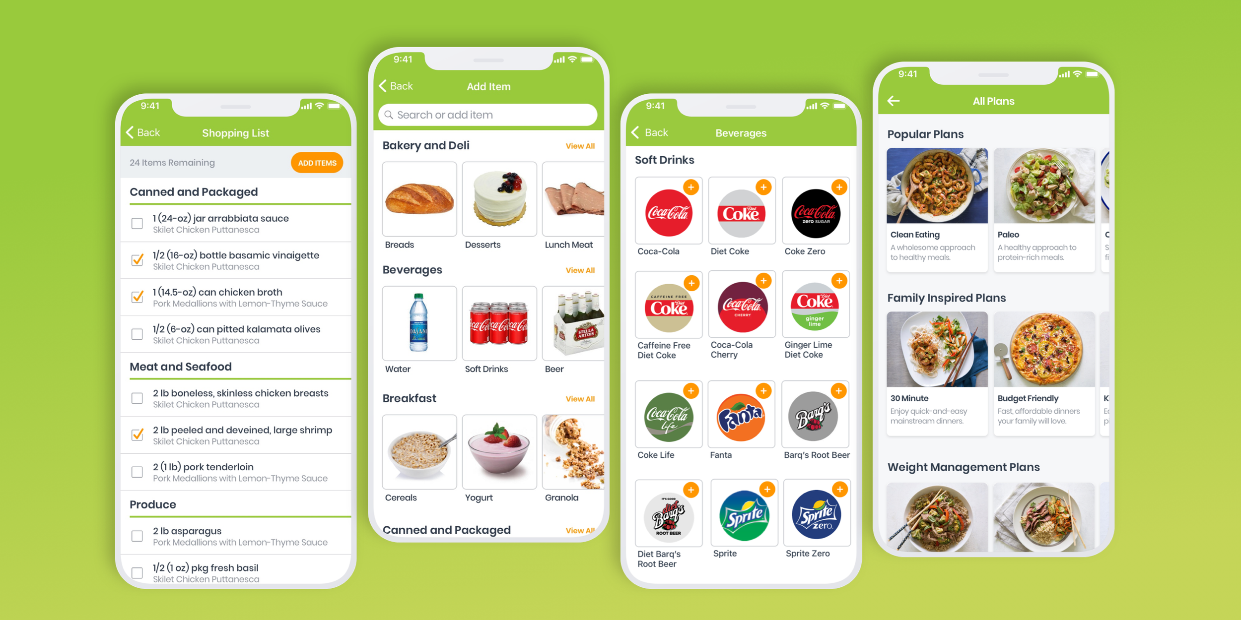
Meal planning made easy and affordable. eMeals customers select desired meals from a large weekly selection of 15 different eating styles - while the app organizes ingredients and sends the shopping list to the grocer and delivery service of their choice.
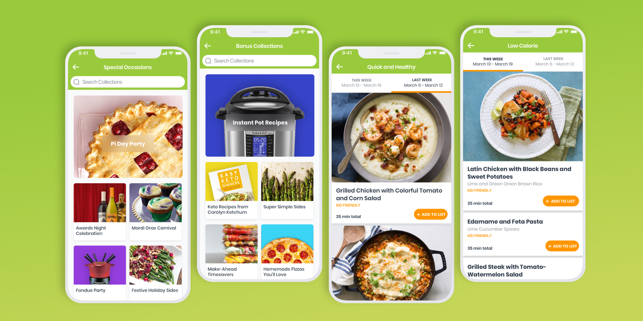
Assessing the User Experience
After a thorough heuristic evaluation, examination of frequent user feedback (as reported to the company’s call center) and user behavior, I identified several main pain points in the eMeals user experience.
Most users sign up for eMeals and are encouraged to pick an initial eating style while assured that they can change that style at any time. When a user logs into the app, they are taken directly to their chosen eating style and the majority of the other content is not visible to them. Many users had to call the help center to figure out how to access other eating styles on the app since the switching process was not intuitive. Lack of seeing the volume of content resulted in users feeling the offering were very sparse and not worth the money.
Adding meals to the cart was a laborious process.
The product offered little in terms of personalization.
The brand voice seemed clinical and overly wordy, the look and feel felt out-dated and not in step with it’s audience.
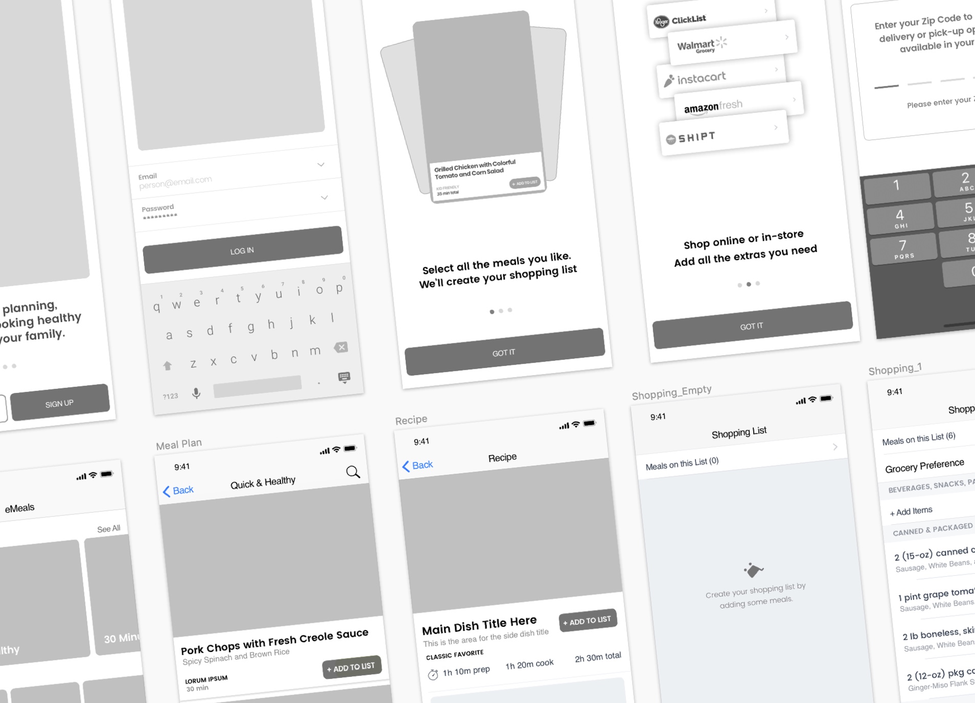
Re-Wiring the App

A New Onboarding Experience

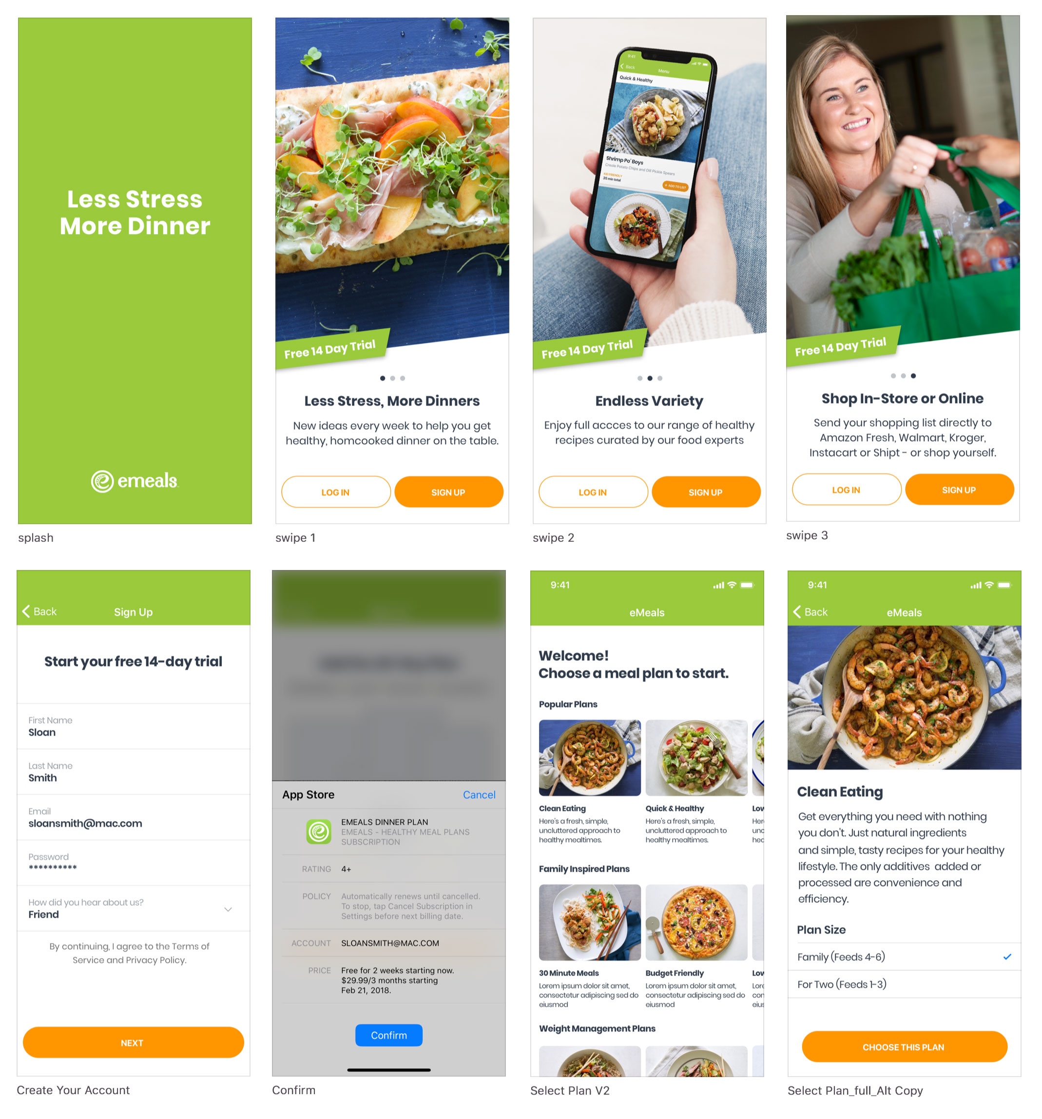
First Time User Experience
Final Visual Design

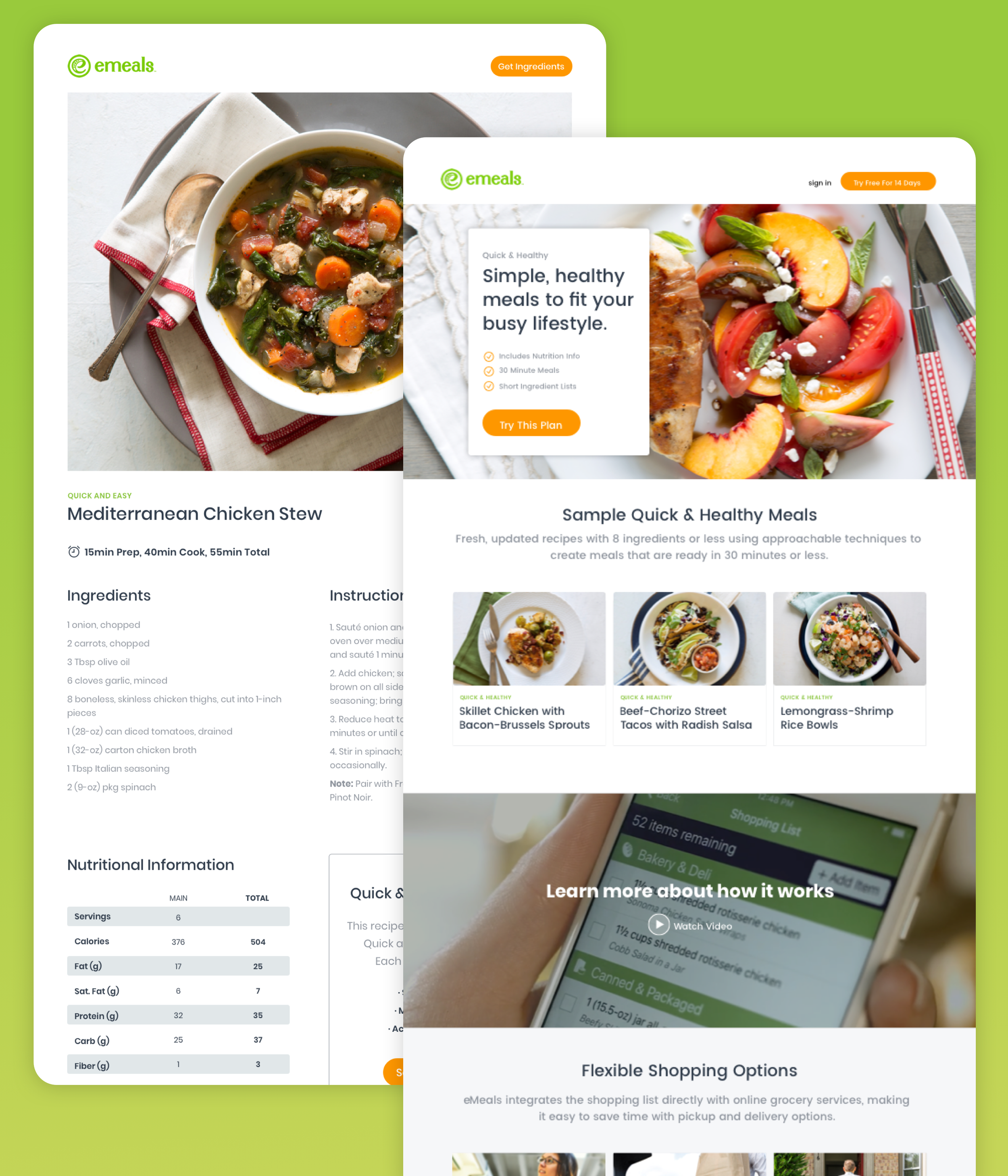
Web
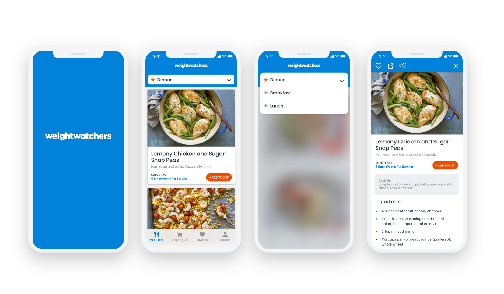
Weight Watchers Integration