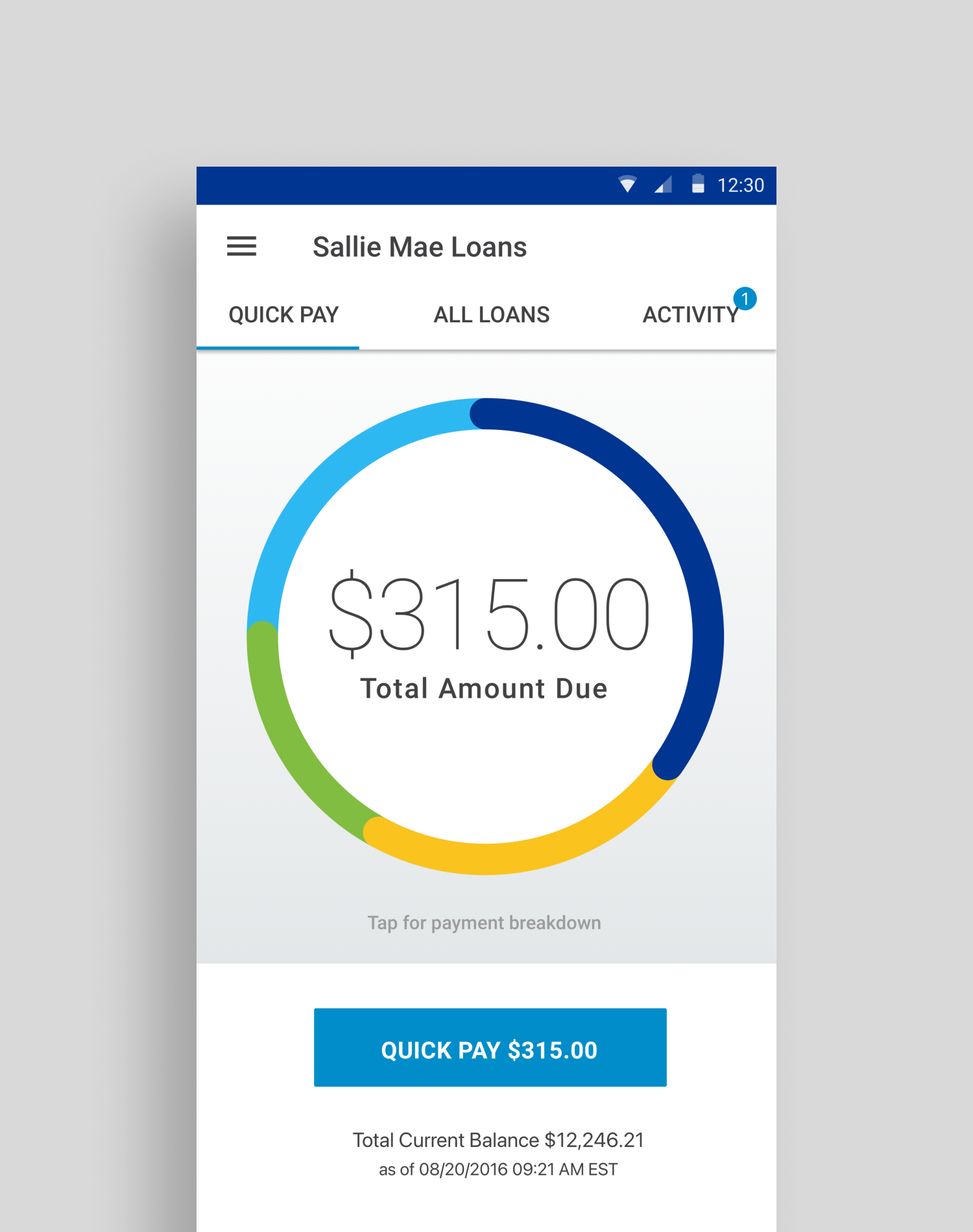
Sallie Mae Loan App
Designing a loan repayment app for the top lender serving students and their families.
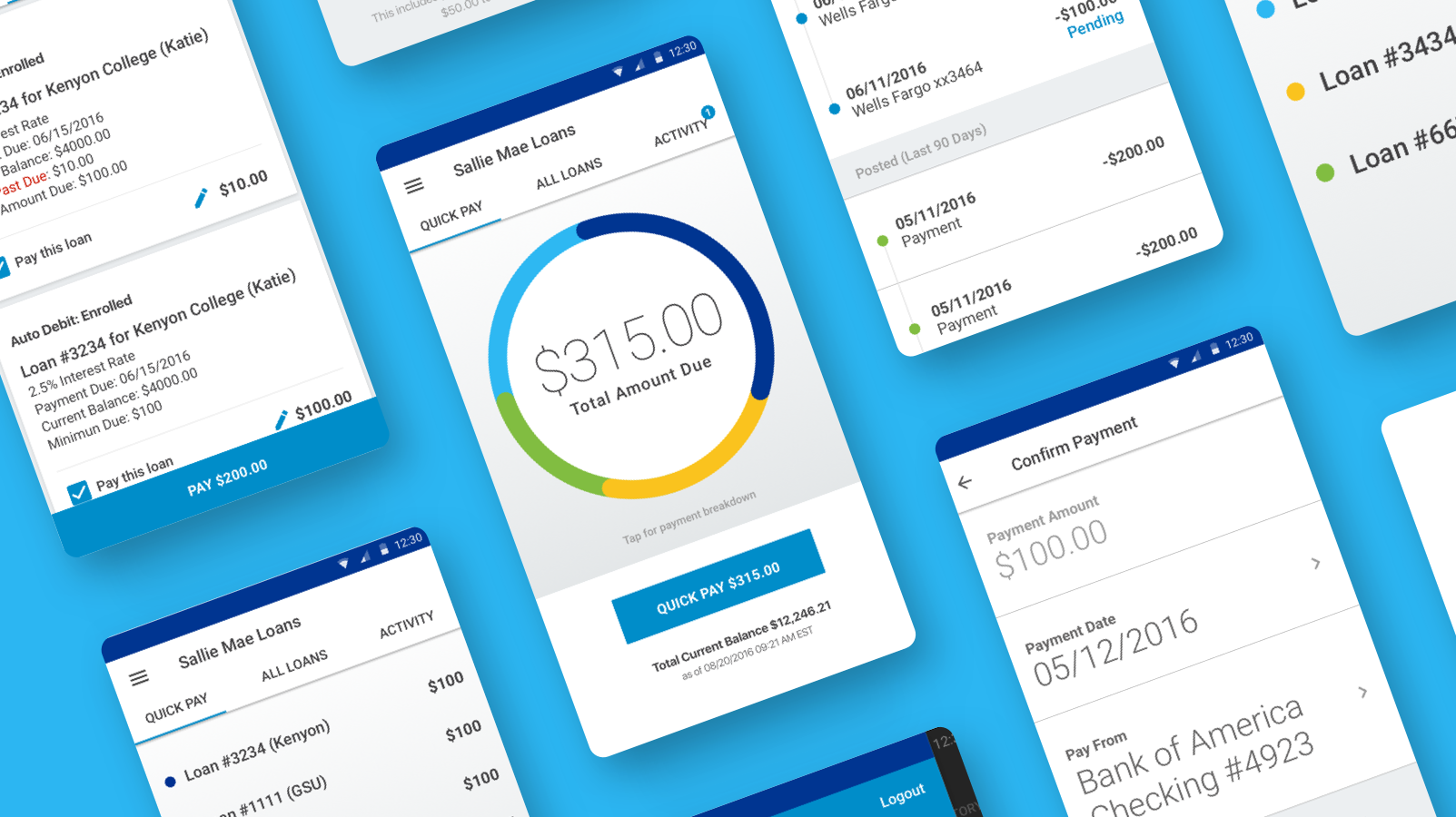
Role: Discovery workshops, user journeys, wireframing, UX and UI design and development handoff
iOS, Apple Watch & Android
Designed for stable|kernel
Context
After seeing a pitch that included a prototype I designed, Sallie Mae selected Stable|Kernel to design and build their first native mobile and watch app. Our task was to create a mobile app that makes the loan repayment process as quick and simple as possible so that borrowers would be less likely to have delinquent accounts.
Solution
A native app that prioritizes getting users through payment completion in seconds.
Phase 1: Discovery
We kicked off the project by spending two days workshopping with Sallie Mae. We talked users, pain points and student loan complexities. We took a deep dive into user behavior within the existing website. Together we worked through multiple user scenarios and loan states until we came up with a feature list for our MVP.
Key Insights
Many users have more than one loan, each with different due dates, states and interest rates
The current payment system on web is confusing and time consuming
Many users let loans go into delinquency possible because the current payment system is not user friendly
Success means take out the guess work for the user
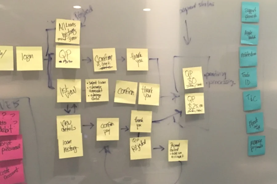
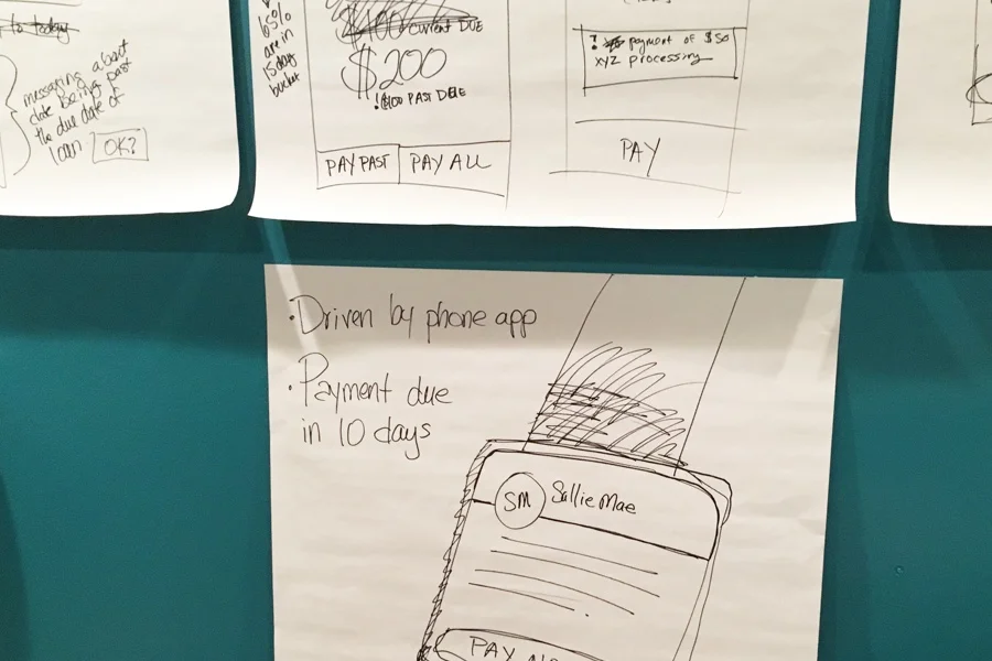
Phase 2: Documenting the User Flow
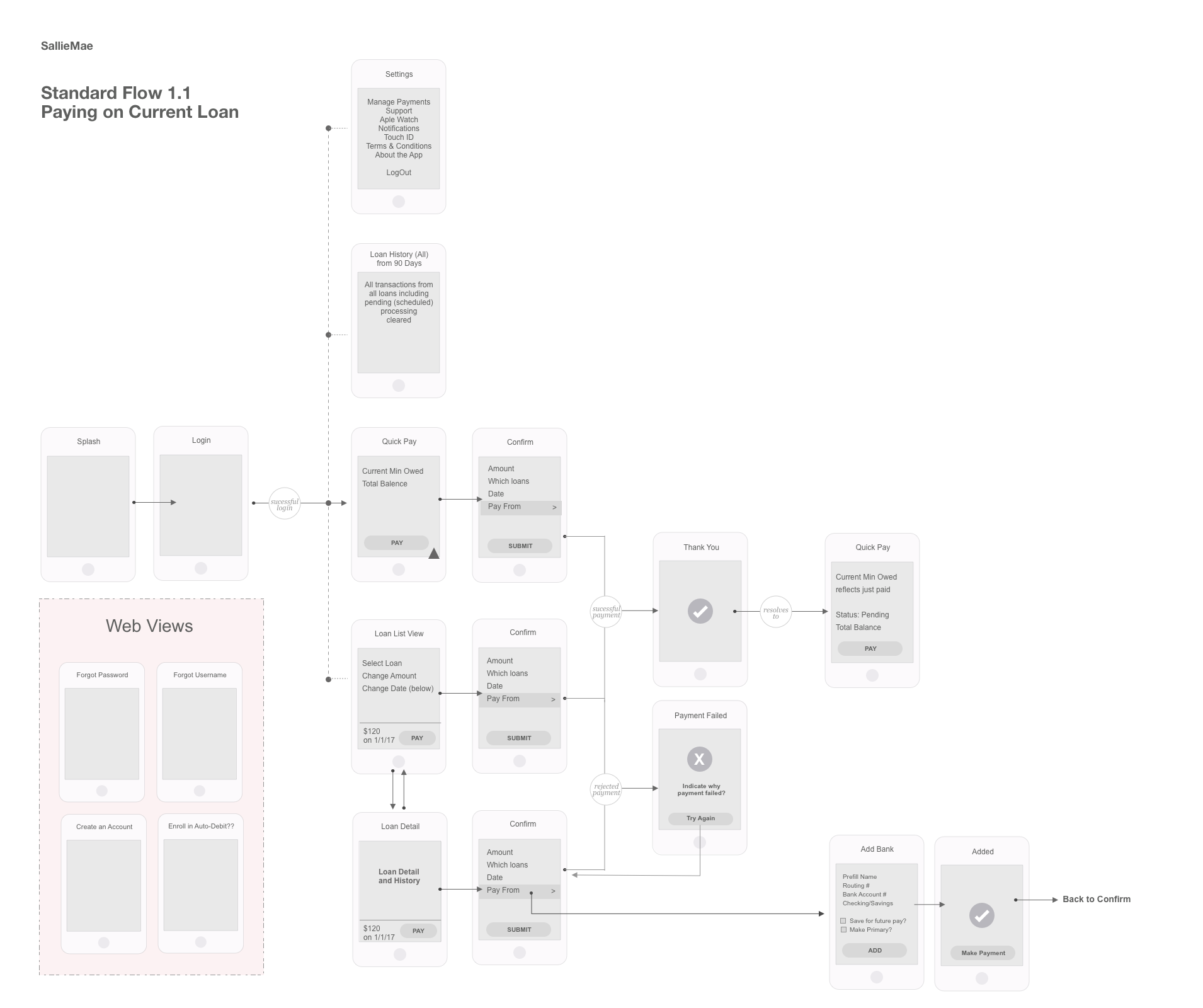
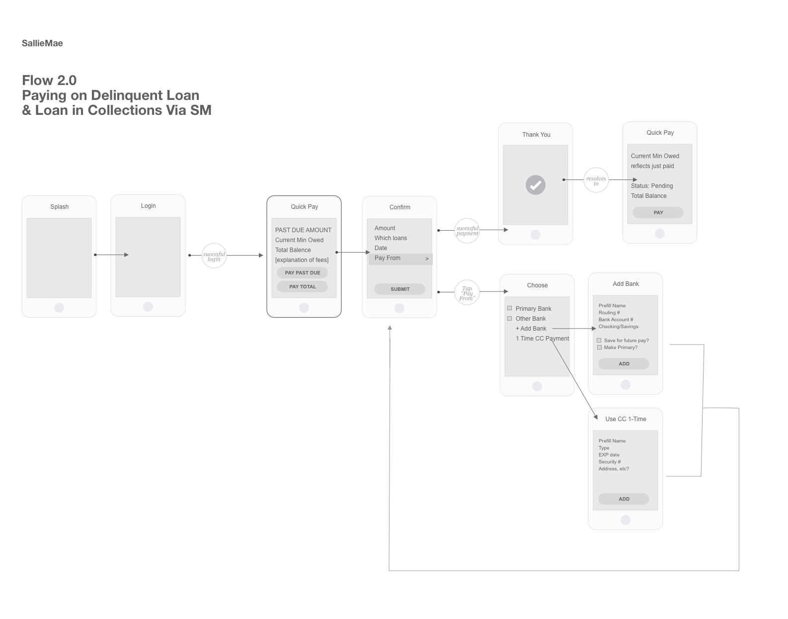
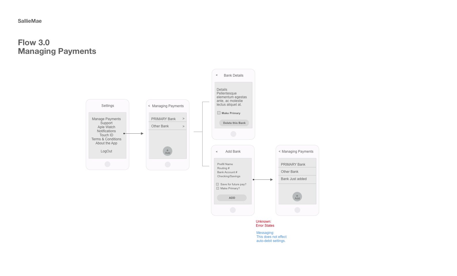
Documenting the User Flow got everyone - myself, project management, developers and Sallie Mae stakeholders on the same page and able to move forward quickly. Keeping in mind how and when users would access the app, we designed a simplified user experience that allows customers to access loan information and make payments in a matter of seconds.
Phase 3: Wireframing the App
Wireframing screens states and content ensured we had the proper content on the correct screens.
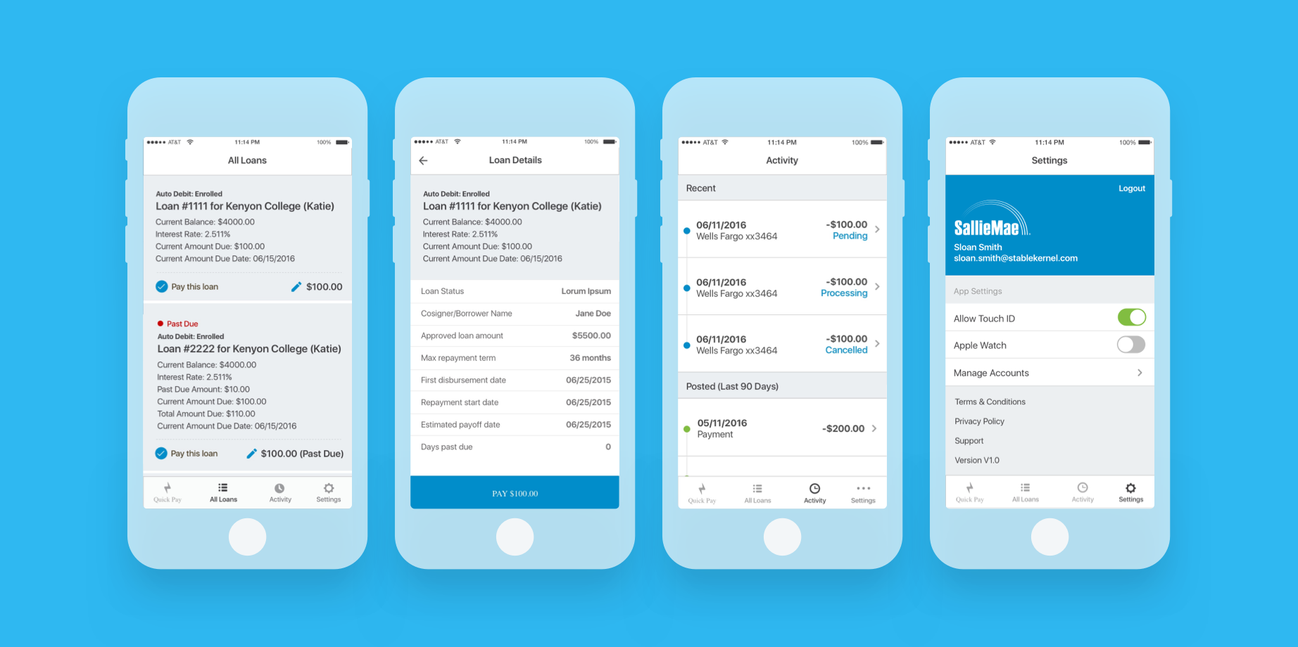
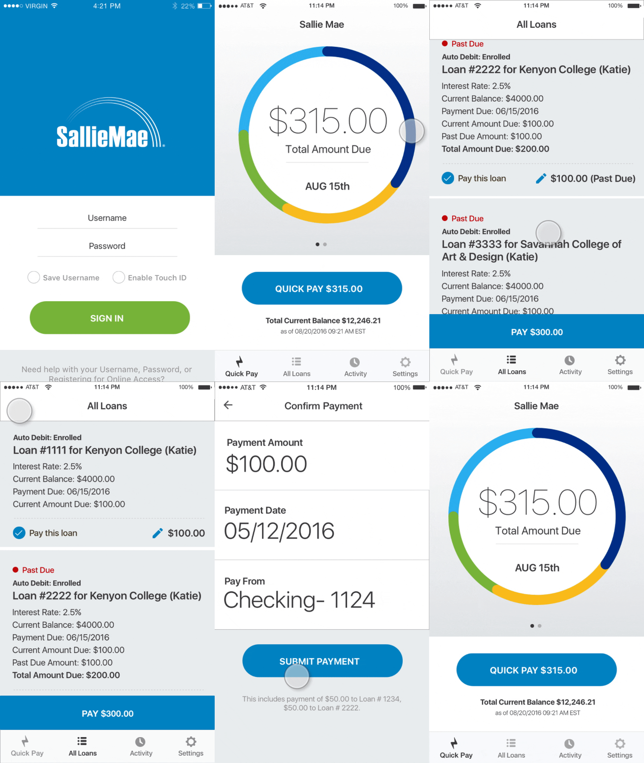
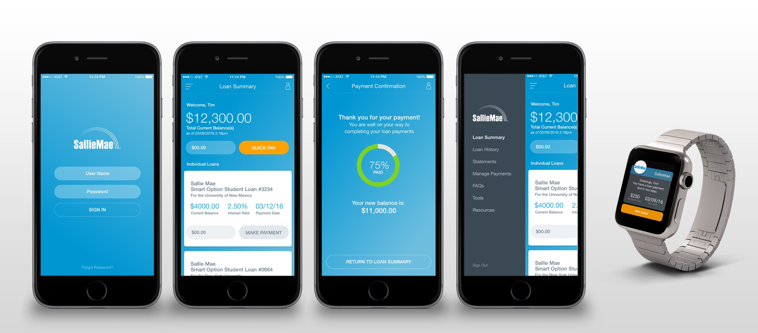
I chose to have the default screen show what we called "Quick Pay". Quick Pay totaled all the minimum due balances for all loans and provided one button to make the transaction happen.
Internal testing was done to validate our work

Phase 4: Visual and Interaction Design
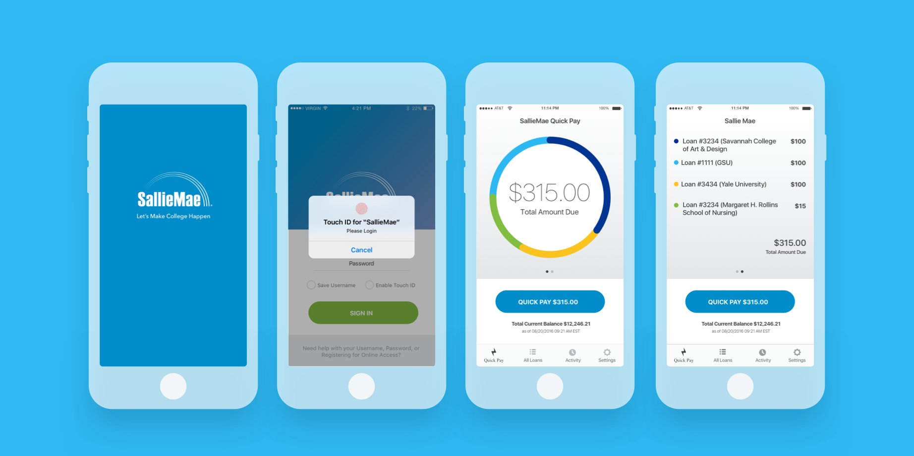
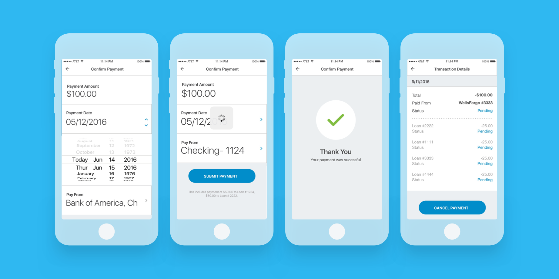
In creating the final visual design, I opted for a sleek, minimal visual style, blending existing brand identity with simplicity—unifying the interface across all areas for an intuitive user experience.
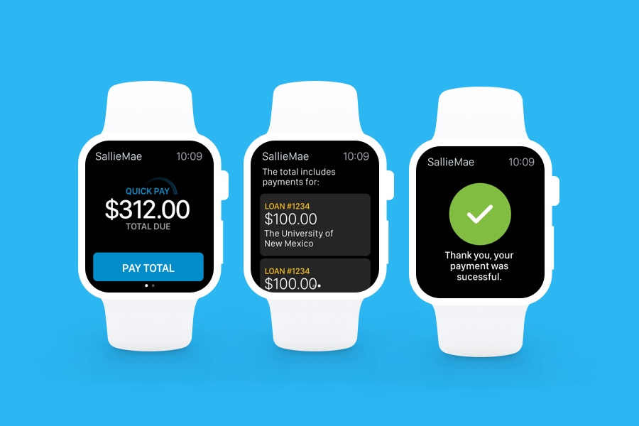
Apple Watch App

Pitch Deck
Outcome
The mobile application has led to a more than 45% adoption rate by Salle Mae’s loan customers–a higher adoption rate than the mobile banking industry standard–and has strengthened its brand connection with students and their families. The app has won numerous FinTech, personal banking, and wearables awards.